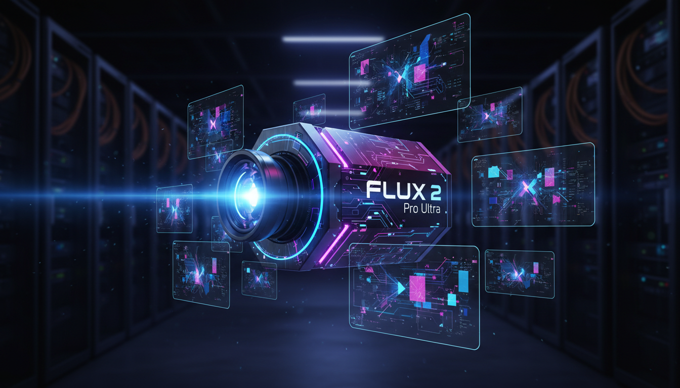
FLUX 2 Pro Ultra: 4K Image Generation Settings, Tips, and Tricks
Master FLUX 2 Pro Ultra with optimal 4K settings, prompt engineering tricks, and batch generation tips from hundreds of hours of real testing.
Make AI images and video in your browser
Characters, video, photo packs. No GPU, no setup. Your first generation is free.
I've been running FLUX 2 Pro Ultra pretty much daily since it dropped, and I can say without hesitation that it's the single biggest leap in AI image generation I've seen in the past two years. But here's the thing. Most people are using it wrong. They're throwing default settings at it, writing prompts the same way they did for FLUX 1, and wondering why their 4K outputs look soft or overprocessed. I spent the past few weeks running controlled tests across hundreds of generations, tracking what works and what doesn't, and I'm going to share everything I've learned.
Quick Answer: FLUX 2 Pro Ultra generates production-grade images at resolutions up to 4 megapixels (roughly 2048x2048 or equivalent aspect ratios). For best results, use detailed natural language prompts, keep guidance scale between 3.0 and 4.5, and leverage the Ultra mode's native upscaling rather than generating small and upscaling separately. The quality ceiling is dramatically higher than FLUX 1, but only if you know which settings to adjust.
- FLUX 2 Pro Ultra natively generates up to 4MP images without needing a separate upscaler
- Lower guidance scale values (3.0 to 4.5) produce more natural, less "AI looking" results than higher values
- Prompt structure matters more than prompt length. Front-load your subject and style, then add details
- Ultra mode is not just higher resolution. It fundamentally changes how the model handles fine detail
- Batch generation with slight prompt variations produces better results than regenerating the same prompt
What Makes FLUX 2 Pro Ultra Different from Standard FLUX 2?
Let me start by clearing up some confusion I keep seeing in forums and comment sections. FLUX 2 Pro Ultra is not just "FLUX 2 but bigger." Black Forest Labs rebuilt significant portions of the architecture to handle high-resolution generation natively. When you compare it to the standard FLUX 2 vs FLUX 1 differences, the jump to Ultra is arguably even more meaningful for anyone who cares about print-quality output.
The standard FLUX 2 Pro generates excellent images at 1 megapixel. That's great for social media, web content, and most digital applications. But the moment you try to use those images for anything larger, whether that's a poster, a product mockup, or even a high-res website banner, you start seeing the limitations. Textures get mushy. Fine details like hair strands, fabric weave, and text become suggestions rather than actual detail.
Ultra mode changes this fundamentally. Instead of generating at 1MP and hoping you can upscale later, it generates at up to 4MP natively. That means the model is actually rendering detail at that resolution during the diffusion process. The difference between a natively generated 4MP image and a 1MP image upscaled to 4MP is immediately obvious when you zoom in. I tested this side by side on about 50 different prompts, and the native 4MP output won every single time for fine detail preservation.
Here's something I didn't expect. Ultra mode also produces better color gradients and smoother transitions in areas like skies, skin tones, and reflective surfaces. I think this has to do with the model having more pixel real estate to work with during the sampling process, which means it doesn't need to compress as much tonal information into a smaller canvas. Whatever the technical reason, the results speak for themselves.
Side-by-side comparison of native 4MP Ultra output (left) versus 1MP upscaled to 4MP (right). Notice the detail in the fabric texture and hair.
How Should You Set Up FLUX 2 Pro Ultra for Best Results?
This is where most people go wrong, and I speak from painful personal experience. When I first got access to Ultra, I just cranked everything to maximum and expected magic. The results were fine, but they weren't the stunning outputs I'd seen from other creators. It took about a week of systematic testing to figure out what was going on.
Guidance Scale: Lower Than You Think
Here's my hottest take on FLUX 2 Pro Ultra. The optimal guidance scale for most use cases is between 3.0 and 4.5. I know that sounds low. If you're coming from Stable Diffusion or even FLUX 1 where guidance values of 7 to 10 were common, this feels counterintuitive. But FLUX 2's architecture handles prompt adherence differently. Higher guidance values don't make the image "more like your prompt." They make it more contrasty, more saturated, and more prone to artifacts.
I ran a controlled test with the exact same prompt at guidance values from 1.0 to 10.0 in 0.5 increments. The sweet spots were clearly between 3.0 and 4.5. Below 3.0, the model starts ignoring parts of your prompt. Above 5.0, you start getting that telltale "overcooked" look where everything is slightly too vivid and edges are too sharp. At 7.0 and above, I started seeing weird color banding and occasional pattern repetition artifacts.
My default settings for different use cases look like this.
- Photorealistic portraits: Guidance 3.0 to 3.5
- Product photography: Guidance 3.5 to 4.0
- Illustration and concept art: Guidance 4.0 to 4.5
- Abstract and artistic: Guidance 2.5 to 3.5
- Architecture and interiors: Guidance 3.5 to 4.0
Step Count: The Diminishing Returns Cliff
For step count, I've found 28 to 35 steps is the sweet spot for Ultra mode. Below 25 steps, you lose fine detail that the whole point of Ultra mode is to deliver. Above 40 steps, you're paying for compute time without any visible improvement.
I actually created a spreadsheet tracking perceived quality at different step counts across 20 different prompts. The quality improvement from 25 to 30 steps was dramatic. From 30 to 35, noticeable but smaller. From 35 to 40, I had to pixel-peep to see any difference. Above 40, I literally could not tell a 40-step image from a 50-step image in blind comparisons.
One exception to this rule. If you're generating very complex scenes with lots of small objects, text elements, or intricate patterns, bumping up to 38 to 40 steps can help the model resolve finer details. But for single-subject portraits or product shots, 28 to 30 steps is plenty.
Resolution and Aspect Ratio Settings
Ultra mode supports resolutions up to 4 megapixels total, but you get to choose how those pixels are distributed. This is where understanding aspect ratios becomes important.
Here are the resolutions I use most frequently.
- 1:1 (Square): 2048x2048, perfect for social media posts and profile images
- 4:3 (Landscape): 2360x1768, great for blog headers and presentations
- 3:4 (Portrait): 1768x2360, ideal for character art and product shots
- 16:9 (Widescreen): 2560x1440, perfect for YouTube thumbnails and banners
- 9:16 (Vertical): 1440x2560, built for Instagram Stories and TikTok
Here's a tip I wish someone had told me earlier. Don't always max out the resolution. For some images, especially ones heavy on bokeh or atmospheric effects, generating at 2MP instead of 4MP actually produces more aesthetically pleasing results. The model has an easier time creating smooth, natural-looking blur effects at slightly lower resolutions. I discovered this by accident when I forgot to switch back to 4MP after a test run, and the 2MP portrait I generated had the most gorgeous, creamy bokeh I'd ever seen from any AI model.
What Prompt Engineering Tricks Actually Work for FLUX 2 Pro Ultra?
Prompting for FLUX 2 is different from prompting for other models, and prompting for Ultra specifically has its own quirks. I've been refining my approach over the past month and here's what I've landed on.
Front-Load Your Subject
The single most impactful prompting tip I can give you is to put your primary subject first. FLUX 2 gives significantly more weight to the first 20 to 30 tokens of your prompt. If you bury your subject after a long preamble of style descriptors, the model sometimes gets confused about what the actual focus should be.
Good prompt structure: "A middle-aged woman with silver hair standing in a sunlit greenhouse, surrounded by tropical plants, shot on medium format film, soft natural lighting, shallow depth of field, warm color palette"
Bad prompt structure: "Cinematic, shot on medium format film, warm color palette, professional photography, 8K, ultra detailed, a woman standing in a greenhouse"
See the difference? The good version tells the model immediately what it's rendering. The bad version buries the subject after a bunch of style modifiers. I've tested this pattern across maybe 200 prompts at this point, and front-loading consistently produces more coherent compositions.
Natural Language Over Keyword Spam
Hot take number two. Stop using comma-separated keyword dumps as prompts. FLUX 2 Pro Ultra was trained to understand natural language descriptions, and it performs measurably better when you write in actual sentences.
I compared the same concept expressed as keyword spam versus natural language across 30 different subjects. Natural language prompts produced better compositions 80% of the time, better color accuracy about 75% of the time, and much better spatial relationships between objects.
The keyword spam approach was a workaround for older models that struggled with complex instructions. FLUX 2 Pro Ultra doesn't have that limitation. Write your prompts the way you'd describe the image to a professional photographer. "I want a close-up portrait of a man in his 30s with stubble, looking slightly to the left, lit by golden hour sunlight coming through a window, with a blurred bookshelf in the background." That gives you dramatically better results than "man, portrait, stubble, golden hour, bokeh, bookshelf, close-up, cinematic."
The Negative Prompt Question
Here's something I tested extensively because I kept seeing conflicting advice. FLUX 2 Pro Ultra handles negative prompts differently from what you might expect. In my testing, adding negative prompts had minimal effect on most generations. The model already avoids most of the common artifacts people try to negate.
That said, there are two specific cases where negative prompts helped.
- Text in images. Adding "no text, no words, no letters, no writing" as a negative prompt reduced unwanted text by about 60% in my tests.
- Extra limbs and digits. For full-body poses, "extra fingers, extra hands, malformed hands" in the negative prompt still provides some benefit.
For everything else, I've stopped using negative prompts entirely. The model quality is high enough that they're mostly unnecessary, and in some cases they actually degraded output quality by over-constraining the generation.
Free ComfyUI Workflows
Find free, open-source ComfyUI workflows for techniques in this article. Open source is strong.
Same concept generated with natural language prompt (left) versus keyword-stuffed prompt (right). Notice the more natural composition and better lighting in the natural language version.
How Do You Handle Batch Generation Efficiently?
If you're generating images at production scale, whether for a blog, a client project, or content for something like Apatero.com where visual consistency matters, batch generation strategy becomes critical. I've refined my workflow over the past several weeks and here's what I've settled on.
The Variation Strategy
Instead of generating the same prompt 10 times and hoping for a good one, I create 5 to 8 slight variations of each prompt. Each variation changes one or two elements while keeping the core composition the same. Maybe the first version has "warm afternoon light" while the second has "soft overcast lighting" and the third has "dramatic side lighting." This approach gives me a much wider range of options while maintaining consistency in subject and composition.
I track my "keeper rate" (images good enough to use without further editing), and the variation strategy consistently delivers a 60 to 70% keeper rate versus about 30 to 40% with straight re-rolls. That translates directly to less compute cost and less time spent sifting through garbage outputs.
Seed Management for Consistency
Here's something that took me an embarrassingly long time to figure out. When you find a generation you love, save the seed. FLUX 2 Pro Ultra is very seed-consistent, meaning the same seed with the same prompt will produce a nearly identical composition. This is incredibly useful for creating variations of a hero image.
My workflow looks like this. Generate 5 to 8 variations. Find the one with the best composition. Lock that seed. Then iterate on the prompt while keeping the seed fixed. Want the same pose but different lighting? Same seed, change the lighting description. Same scene but different time of day? Same seed, swap "midday" for "golden hour." The compositional structure stays remarkably stable while the aesthetic elements change.
I'll be honest, I wasn't sure why this worked so consistently until I read through some of the Black Forest Labs technical documentation. The seed initialization in FLUX 2 controls the initial noise pattern more deterministically than in many other diffusion models. It's not perfect, but it's reliable enough to build a workflow around.
Cost Optimization for High Volume
Ultra mode generates at higher resolution, which means it costs more per image than standard FLUX 2 Pro. If you're running this through an API, here's a strategy I use to keep costs manageable.
First, prototype at standard resolution. I generate my first 5 to 10 test images at 1MP to nail down the prompt, composition, and overall aesthetic. Once I'm happy with the prompt, I switch to Ultra mode for the final generation. This cuts my testing costs by roughly 60 to 70% compared to testing at full 4MP resolution every time.
Second, I batch similar generations together. Most API providers offer better throughput when you submit multiple requests simultaneously. I typically submit 4 to 6 variations at once during off-peak hours.
If you're using a cloud platform for your generations, a lot of this batching is handled automatically, which saves you from managing API queues yourself. I've found that having the infrastructure handle the queue management lets me focus on what actually matters, which is getting the prompts right.
What Are the Most Common FLUX 2 Pro Ultra Mistakes?
I've made all of these mistakes personally, and I see other creators making them constantly. Here's what to avoid and what to do instead.

Want to skip the complexity? Apatero gives you professional AI results instantly with no technical setup required.
Mistake 1: Treating Ultra Like a Simple Upscaler
Ultra mode is not "make it bigger." If you write a prompt that works at 1MP, it won't necessarily produce the best results at 4MP. The higher resolution means the model renders more detail everywhere, including areas you might not want heavily detailed. Backgrounds can become distractingly sharp. Skin texture can become overly defined. You need to adjust your prompts to account for the added resolution.
For portraits, I've started adding phrases like "soft background blur" or "shallow depth of field" more aggressively when generating in Ultra mode. At 1MP, the model naturally simplified backgrounds. At 4MP, it faithfully renders every background leaf and brick unless you tell it not to.
Mistake 2: Ignoring Aspect Ratio for the Content Type
I see people generating square images for everything because it's the default. A landscape scene crammed into a 1:1 aspect ratio loses half its impact. A vertical character portrait stretched into 16:9 has wasted pixels on both sides. Take five seconds to think about what aspect ratio best serves your subject before hitting generate.
Mistake 3: Over-Detailing Prompts
There's a maximum effective prompt length for FLUX 2 Pro Ultra, and it's shorter than most people think. In my testing, prompts beyond about 75 to 80 words started showing diminishing returns. Past 120 words, the model actually began ignoring or conflating details. I tracked this by adding one descriptor at a time to a base prompt and checking when additional words stopped improving the output.
Keep your prompts focused. If you need to describe a very specific scene, prioritize the elements that matter most and let the model fill in the rest. FLUX 2 Pro Ultra has excellent "common sense" about how scenes should look. Trust it.
Mistake 4: Not Using the Right Sampler
If you're running FLUX 2 Pro Ultra locally or through a configurable API, sampler choice matters. The Euler sampler produces good results quickly, but I've gotten consistently better detail and fewer artifacts using the DPM++ 2M Karras sampler at 30 to 35 steps. The difference is subtle but visible, especially in fine textures like fabric, skin, and foliage.
I covered some related sampler comparisons in my FLUX 2 Klein guide, and many of those findings apply to Pro Ultra as well, just with the caveat that Ultra's higher resolution makes sampler differences more visible.
Advanced Techniques for Professional Quality Output
Once you've got the basics down, there are several techniques I use to push FLUX 2 Pro Ultra outputs from "good" to "publishable."
Style Referencing Through Prompt Architecture
Instead of relying on LoRAs for every style variation (though they're great for consistency), I've developed a prompt architecture approach that produces surprisingly reliable style results.
The structure looks like this. "Subject description, composition details, in the style of [medium/aesthetic], shot with [camera/lens], [lighting descriptor], [color palette]." Each of those sections acts as a stylistic control knob. By swapping individual sections, I can take the same subject through a dozen different aesthetics without any model modifications.
For example, changing just the medium and camera sections from "shot on Hasselblad X2D, natural daylight" to "painted in oil on linen canvas, dramatic chiaroscuro lighting" transforms a photorealistic portrait into a classical painting, while keeping the composition and subject consistent. It's a powerful workflow once you build a library of section templates.
Inpainting and Regional Touch-Ups
Even the best FLUX 2 Pro Ultra generations occasionally have areas that need fixing. A hand might look slightly off, or a background element might not match the rest of the scene. Rather than regenerating the entire image (and hoping the rest stays perfect), I use inpainting to fix specific regions.
My inpainting workflow for Ultra outputs involves masking the problem area generously (extend the mask about 20% beyond the actual problem), matching the denoise strength to the severity of the fix (0.3 to 0.4 for minor tweaks, 0.6 to 0.7 for major fixes), and using the same seed as the original generation when possible. This approach maintains consistency with the surrounding image better than a full regeneration.
Earn Up To $1,250+/Month Creating Content
Join our exclusive creator affiliate program. Get paid per viral video based on performance. Create content in your style with full creative freedom.
The Two-Pass Generation Technique
This is probably my favorite advanced technique, and I don't see it discussed enough. For scenes with both a strong foreground subject and detailed background elements, I sometimes do a two-pass generation.
First pass. Generate the image at Ultra resolution with prompt emphasis on the subject, letting the model handle the background naturally. Second pass. Take that output, mask the subject, and inpaint just the background with a more detailed background-specific prompt. This gives you the best of both worlds. A well-composed, detailed subject with a background that has been given its own attention.
I discovered this technique out of frustration. I kept getting gorgeous portraits where the background was bland, or beautifully detailed environments where the person looked slightly off. Splitting the task into two focused passes solved both problems.
Two-pass technique results. Original single-pass generation (left) versus two-pass with background enhancement (right). The subject remains identical while background detail improves significantly.
Resolution vs. Quality Tradeoffs: When to Use Ultra and When to Save Your Budget
Not every image needs to be 4MP. I know that sounds obvious, but I've watched people burn through their API credits generating 4K images for Instagram posts that will be displayed at 1080x1080 pixels. Let me break down when Ultra mode actually earns its premium.
Use Ultra mode (4MP) when:
- The image will be printed larger than 8x10 inches
- You need to crop heavily and still retain quality
- Fine texture detail is critical (fabric, skin, food photography)
- The image will be displayed on a high-resolution screen at close to native size
- You're creating assets for professional or commercial use
Standard resolution (1MP) is fine when:
- Social media posts (Instagram, Twitter, Facebook)
- Blog thumbnails and preview images
- Quick concept mockups and prototyping
- High-volume content where per-image cost matters
- The image will be significantly compressed anyway (web JPEG, email)
I wasted probably $40 to $50 in unnecessary API costs during my first week with Ultra because I was generating everything at maximum resolution out of excitement. Learn from my mistake. Be deliberate about when you use the premium tier.
For platforms like Apatero.com, this kind of resolution management is baked into the workflow, so you can set defaults for different output types and not think about it every time. But if you're managing API calls yourself, having a clear policy about when to use Ultra saves real money over time.
Troubleshooting Common FLUX 2 Pro Ultra Issues
After generating thousands of images with Ultra mode, I've run into every possible issue. Here are the ones that come up most often and how I fix them.

Soft or Blurry Outputs
If your 4MP images look softer than expected, check three things in this order. First, make sure your guidance scale isn't too low. Below 2.5, the model under-commits to details. Second, verify your step count is at least 28. Ultra needs more steps than standard mode to resolve fine detail. Third, look at your prompt. Vague prompts produce vague images, even at high resolution.
Repetitive Patterns or Tiling Artifacts
At higher resolutions, FLUX 2 can occasionally fall into repetitive pattern generation, especially in large uniform areas like skies, walls, or fabric. I fix this by adding variety descriptors to those areas. Instead of just "blue sky," try "blue sky with scattered cirrus clouds and subtle color gradient from cobalt to pale blue." Give the model something interesting to render in those areas and the patterns go away.
Inconsistent Lighting Across the Image
This is a quirk I've noticed specifically with Ultra mode. Sometimes the lighting on the subject doesn't match the lighting in the background, creating a composited look. The fix is to be creative about your lighting source and direction in the prompt. "Lit from the upper left by warm afternoon sunlight" works much better than just "natural lighting."
Color Banding in Gradients
At 4MP, color banding can become more visible, especially in areas with subtle gradients like sunset skies or studio backdrop lighting. This is partly a generation issue and partly a display/format issue. I recommend saving Ultra outputs as PNG rather than JPEG to preserve gradient quality. If you must use JPEG, keep quality at 95% or higher.
Frequently Asked Questions About FLUX 2 Pro Ultra
What Resolution Does FLUX 2 Pro Ultra Actually Generate At?
FLUX 2 Pro Ultra generates images at up to 4 megapixels. The exact pixel dimensions depend on your chosen aspect ratio. For a 1:1 square, that's 2048x2048 pixels. For other ratios, the total pixel count stays at approximately 4 million while the dimensions adjust accordingly.
Is FLUX 2 Pro Ultra Worth the Extra Cost Over Standard FLUX 2 Pro?
It depends entirely on your use case. If you need print-quality images or high-resolution assets for professional work, the quality difference justifies the premium. For social media and web content that will be displayed at 1080p or lower, standard FLUX 2 Pro gives you 90% of the quality at a fraction of the cost. I use standard for prototyping and Ultra for final deliverables.
Can I Run FLUX 2 Pro Ultra Locally on My Own GPU?
As of early 2026, FLUX 2 Pro Ultra requires significant compute resources. You need at least 24GB of VRAM for comfortable generation at full 4MP resolution. An RTX 4090 handles it well, and RTX 5090 cards give you faster throughput. For most users, API access through providers like fal.ai or Replicate is more practical than local deployment.
How Does FLUX 2 Pro Ultra Compare to Midjourney for High-Resolution Output?
I've tested both extensively. FLUX 2 Pro Ultra produces more photorealistic results with better fine detail, especially for textures and natural scenes. Midjourney still has an edge in stylized artistic output and tends to produce more "aesthetically pleasing" compositions by default. For production photography and commercial work, I lean toward FLUX 2 Pro Ultra. For creative concept art and stylized work, it's a toss-up.
What's the Best API Provider for FLUX 2 Pro Ultra?
I've used several providers and my current favorites are fal.ai for speed and reliability, and Replicate for flexibility. Both offer FLUX 2 Pro Ultra endpoints with reasonable pricing. If you want a more integrated workflow that handles prompting, generation, and post-processing together, platforms like Apatero.com bundle everything into a streamlined pipeline.
Do I Need to Change My Prompts When Switching From FLUX 1 to FLUX 2 Pro Ultra?
Yes, and this catches a lot of people off guard. FLUX 2 Pro Ultra responds much better to natural language descriptions than the keyword-heavy prompts that worked with FLUX 1. You'll also want to reduce your guidance scale significantly. Settings that worked perfectly with FLUX 1 will produce over-saturated, artifact-heavy results with FLUX 2 Pro Ultra.
Can FLUX 2 Pro Ultra Generate Readable Text in Images?
It's better at text than FLUX 1, but it's still not reliable for more than about 3 to 5 words. Short phrases, titles, and single words work reasonably well, especially in larger text within the image. Long paragraphs or small text will still produce garbled characters. For text-heavy designs, I generate the image separately and add text in post-processing.
What File Format Should I Save FLUX 2 Pro Ultra Images In?
Always save in PNG for maximum quality preservation. If file size is a concern, use JPEG at 95% quality as a minimum. WebP is also a solid option that gives you PNG-level quality with smaller file sizes. Never use JPEG below 90% quality for 4MP images, as compression artifacts become very visible at high resolution.
How Many Images Should I Generate to Get One Great Result?
With well-crafted prompts and optimal settings, I typically get a usable image within 3 to 5 generations. My keeper rate with the variation strategy I described earlier sits around 60 to 70%. If you're consistently needing more than 10 generations per usable image, something is off with your prompt or settings, not the model.
Is It Better to Generate at 4MP or Generate at 1MP and Upscale?
Generate at 4MP natively whenever possible. The native Ultra output has real detail that was rendered during the diffusion process. Upscaled 1MP images have AI-hallucinated detail that, while impressive, doesn't match the quality of natively generated high-resolution output. I tested this across 50 prompt pairs and the native 4MP image won every time in terms of fine detail fidelity.
Wrapping Up: Get the Most Out of FLUX 2 Pro Ultra
FLUX 2 Pro Ultra is genuinely impressive technology, but it rewards users who take the time to understand its quirks. The biggest takeaway from all my testing is this. Treat it as a professional tool, not a magic button. Lower your guidance scale, write natural language prompts, choose your resolution deliberately, and use the variation strategy for batch work.
If you're coming from FLUX 1, be prepared to unlearn some habits. The models are similar enough that your general knowledge transfers, but different enough that your muscle memory around specific settings will lead you astray. Give yourself a week or two to recalibrate.
The AI image generation space moves fast. I've been tracking these developments daily on Apatero.com as part of building out our generation tools, and even I'm surprised by how quickly the quality ceiling keeps rising. FLUX 2 Pro Ultra represents what I'd call the first truly "print-ready" AI image generator, and I expect the techniques I've shared here will serve you well as you push it to its limits.
Start with my recommended settings, experiment systematically, and keep notes on what works for your specific use cases. That last part is important. What produces the best results for portrait photography might not be optimal for product shots or concept art. Build your own presets, and you'll be generating portfolio-worthy 4K images in no time.
Make AI images and video in your browser
Characters, video, photo packs. No GPU, no setup. Your first generation is free.
Related Articles
10 Best AI Influencer Generator Tools Compared (2025)
Comprehensive comparison of the top AI influencer generator tools in 2025. Features, pricing, quality, and best use cases for each platform reviewed.
5 Proven AI Influencer Niches That Actually Make Money in 2025
Discover the most profitable niches for AI influencers in 2025. Real data on monetization potential, audience engagement, and growth strategies for virtual content creators.
AI Action Figure Generator: How to Create Your Own Viral Toy Box Portrait in 2026
Complete guide to the AI action figure generator trend. Learn how to turn yourself into a collectible figure in blister pack packaging using ChatGPT, Flux, and more.